home
works
about
Résumé
contact
Design
Ohmyhome

From 1% to 3.7%: How a desktop redesign drove booking conversions

The context

about the product

Digital LP (Listing Presentation) is a product in which home sellers would book an agent (for free!) in order to discuss their selling plans. It is one of Ohmyhome’s main stream of getting revenue.

my role

I am the designer and I inherited the product mid-stream after the original designer left.

the team

Me as the main designer and getting UX feedback from my creative lead. Working closely with a PM and an engineer.

The problem

PROBLEM #1

Unoptimized desktop view

The flow was initially designed mobile-first since most of the user are on their phones. Resulting for the desktop view to be an after-thought.

PROBLEM #2

Doesn’t empathize for unsure sellers

There is an unclear option for unsure sellers, resulting for the user to feel they’ve went through everything and got nothing at the end, causing them to  drop-off.

What I did

PROBLEM #1: Unoptimized desktop view

From buried CTAs to clear actions

old design

The initial goal for this page is to guide users to read everything what’s in it for them if they decide to sell with Ohmyhome. That’s why the CTAs are at the bottom. Though, the problem with this is users will not likely read everything, resulting for the CTA to not be seen. This would, of course, leave the users hanging on what to do next.

new design

In the new design, I created a clear divide between the side for the information they need to read and the actions that they need to respond to.I’ve also put all the things that the user needs to read on the left side, since that’s the side that their eyes will land to as they arrived in the page.

PROBLEM #1: Unoptimized desktop view

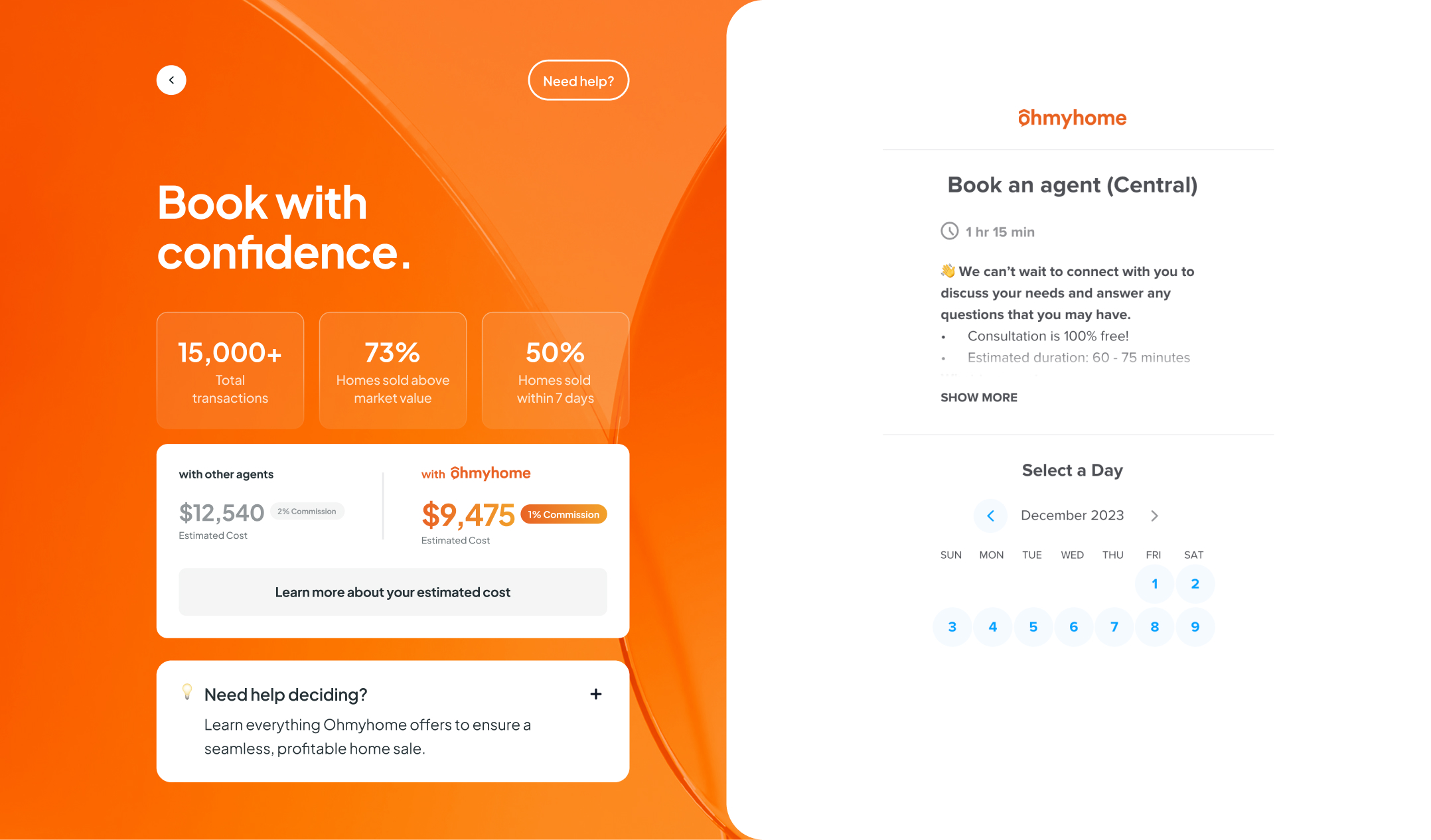
Making the Book an Agent flow feel like a checkout screen

old design

The initial design lets users focus on booking the agent. No distractions, no reading of information, the design is just simply asking them to do one thing. This is good if the user is really sure to book an agent with Ohmyhome.

new design

In the new design, yes, we’ll ask them to read information again but those information is re-assurance that they’re in good hands and they can trust Ohmyhome. This screen also acts like a checkout screen, so basically they’ll see what they would be getting and a few USPs.

PROBLEM #2: Doesn’t empathize for unsure sellers

Supporting sellers at every stage

old design

The initial design only empathize with the users who are ready to sell. The secondary CTA is for users who aren’t yet sure if they want to sell now and the text for the that is not optimize for unsure sellers. “Learn more” feels like a supporting button for the main CTA.

new design

In the new design, I gave the users a clarity of what is the main action that the flow wants them to do. Highlighting it, putting the 1% commission USP, and social proof. Though, obviously not all of them would click it and that’s why I gave them clear alternative options whether they’re selling soon or don’t really want to sell yet and just looking around.

What made it hard

Making sure that the new desktop layout is still functional on small desktops

Due to the nature of my design in which the screen is split into two columns, the chances of it being functional in small desktops is quite low. So, the team and I have to make sure it is functional and responsive. There were quite a lot of back and forth between me and the dev.

External calendar in booking has its’ own success screen

One of the cons of using an external calendar for booking is, the team couldn’t have full control, specially on the design and flow. So the team and I made sure that there is only a split second where the success screen of the calendar could be seen or else the user would drop-off.

What's the result

Conversion rate growth

3.6x increase since the launch of the new design.
Old design
New design

feb 2025

1.03%

MAR 2025

3%

apr 2025

3.7%

Higher conversion growth in desktop view

Significant boost in screen widths ≥ 1.4K px
Old design
New design
Larger laptops

feb 2025

0

MAR 2025

4.8%

apr 2025

20%

Standard 13-14” laptops

feb 2025

0

MAR 2025

7.1%

apr 2025

16.7%

Standard phones

feb 2025

1.82%

MAR 2025

1.4%

apr 2025

0

Small phones

feb 2025

0

MAR 2025

3.7%

MAR 2025

1.7%

What I’d do differently

Optimize the mobile view

The project focus was on fixing desktop issues, so mobile didn’t get the same attention. I wish I had more time to refine the mobile layout, especially for smaller screens where key actions were harder to notice or interact with.

Pushed for micro-interactions and transition of cards

Adding simple transitions or hover effects could have made the interface feel smoother and more intuitive. Small details like that help guide users and make the product feel more polished.

Read next

✳︎

Read next

✳︎

Read next

✳︎

Read next

✳︎

Read next

✳︎

Read next

✳︎

Read next

✳︎

Read next

✳︎

Read next

✳︎

Read next

✳︎

Read next

✳︎

Read next

✳︎

Experience • Design
Ohmyhome

Selling the dream: Redesigning the listing page with an AI twist